Physical Address
304 North Cardinal St.
Dorchester Center, MA 02124
Physical Address
304 North Cardinal St.
Dorchester Center, MA 02124
lovingmyhomeblog.com contains affiliate links and is a member of the Amazon LLC Associates Program. If you make a purchase using one of these Amazon links, I may receive a commission at no extra cost to you. See my Privacy Policy for more information.
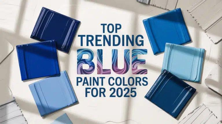
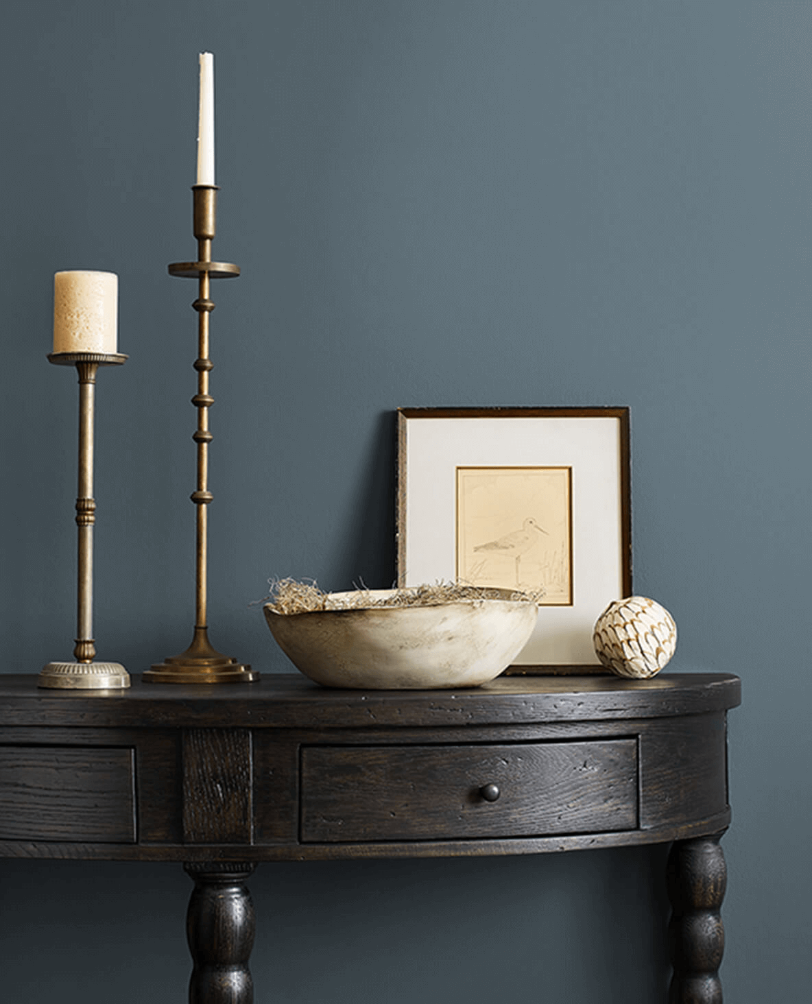
Blue has always been a versatile and beloved color in home decor, but 2025 is bringing us some particularly stunning blue paint trends that deserve your attention.
Whether you’re planning a complete room makeover or simply looking to refresh a space with an accent wall, these trending blue paint colors offer something for every style and preference.
Blue continues to be a dominant force in interior design for 2025, with paint companies featuring various shades of blue in their color of the year selections.
The appeal lies in blue’s remarkable versatility – it can be soothing and serene or bold and dramatic depending on the particular shade and how it’s used. According to color experts, the trending blues of 2025 reflect our collective desire for both comfort and sophistication in our living spaces.
Part of Sherwin-Williams’ 2025 Color Capsule of the Year, Rain Cloud is a smoky blue that provides a deep sense of calm, making it perfect for spaces intended for reflection, relaxation, and tranquility. This stormy and deep gray-blue hue bridges classic design and contemporary updates.
What makes Rain Cloud special is its perfect balance of blue, green, and gray undertones, creating a sophisticated neutral that works beautifully in various lighting conditions. With an LRV (Light Reflectance Value) of 11, it’s a medium-dark shade that adds considerable depth to any space without feeling overly heavy.
Best uses for Rain Cloud:

Dark, moody blues are having their moment in 2025, and Midnight Sonata by Valspar epitomizes this trend. This rich, intense blue brings a powerful injection of deep blue intensity that works beautifully in both kitchens and living areas. For best results, style it with softer neutral shades to create visual balance.
Midnight Sonata offers a sophisticated backdrop that can easily transition between classic and contemporary design styles. Its depth creates a sense of luxury and intimacy in any room it graces.
Best uses for Midnight Sonata:
For a blue that’s truly on-trend for 2025, Tuxedo Blue delivers sleek sophistication perfect for adding drama to any area. This shade works especially well in smaller spaces where you want to inject character and depth without overwhelming the room.
Its name perfectly captures its essence – a formal, elegant blue that’s dressed to impress, just like a tuxedo. The color brings a refined quality to spaces while maintaining warmth and approachability.
Best uses for Tuxedo Blue:
Another standout in Valspar’s 2025 blue collection is Back of Beyond, which features subtle green undertones for a unique take on blue. This versatile shade looks smart as a backdrop for lounges, day rooms, or home offices.
The slight green influence gives this blue a more natural, earthy quality that connects beautifully with other nature-inspired elements in your decor. It creates a soothing atmosphere while maintaining visual interest.
Best uses for Back of Beyond:

Named Dutch Boy Paints’ 2025 Color of the Year, Mapped Blue is a versatile medium-tone blue with subtle yellow undertones. This thoughtfully balanced hue provides a timeless foundation that can adapt to evolving personal styles.
What makes Mapped Blue stand out is its ability to work with both warm and cool color palettes, thanks to its subtle yellow undertones and slight hint of gray. It’s bright enough to feel fresh but grounded enough to have staying power.
Best uses for Mapped Blue:
A sophisticated jewel tone, Encore (Valspar’s 2025 Color of the Year) represents a shift toward richer, more saturated blues. This deep blue blends seamlessly with both modern interiors and Old World design styles.
According to Sue Kim, Valspar’s director of color marketing, “Its atmospheric deep blue tones emulate both the elusive luxury of old world design and the futuristic blending of our physical and digital world, making it a color that feels familiar and unexpected at the same time.”
Best uses for Encore:
Blue paint colors are remarkably versatile when it comes to color combinations. Here are some winning combinations for 2025’s trending blues:
Living Room: Use Rain Cloud or Mapped Blue as a whole-room color for a sophisticated, serene background. For more drama, consider Midnight Sonata or Tuxedo Blue for an accent wall behind your main seating area.
Bedroom: The calming properties of blue make it ideal for bedrooms. Rain Cloud creates a cozy, intimate atmosphere, while lighter blues like Mapped Blue can make the space feel more open and airy.
Kitchen: Consider using one of 2025’s trending blues on kitchen cabinetry for a stand-out look. Midnight Sonata or Rain Cloud on lower cabinets paired with white uppers creates a beautiful balance.
Bathroom: Create a luxurious “jewel box” bathroom with Encore or Tuxedo Blue on all walls. For a more subtle approach, use Back of Beyond with plenty of white tile and fixtures.
Home Office: The focus-enhancing properties of blue make it perfect for work spaces. Rain Cloud or Mapped Blue provide a productive atmosphere without being distracting.
When selecting your perfect blue for 2025, keep these factors in mind:
The blue paint colors trending in 2025 offer exciting possibilities for home decor, from the deep, smoky sophistication of Rain Cloud to the versatile timelessness of Mapped Blue. Whether you’re ready to embrace the moody blues with Midnight Sonata and Tuxedo Blue or prefer something with green undertones like Back of Beyond, there’s a blue waiting to transform your space.
These trending blues reflect our collective desire for colors that are both grounding and uplifting, traditional yet fresh. By incorporating one of these beautiful blues into your home, you’ll create a space that feels both current and timeless—the perfect balance for 2025 and beyond.
What blue paint color are you most excited to try in your home this year? Share your thoughts in the comments below!
A comprehensive collection of the most popular blue paint colors from leading brands, perfect for your next project.
Blue is one of the most versatile and popular paint colors, creating spaces that feel serene, sophisticated, or dramatic depending on the shade. From light, airy blues that open up a space to deep navy tones that add richness and depth, blue paint offers endless possibilities for interior and exterior design.
This guide showcases the most popular blue paint colors from Benjamin Moore, Sherwin Williams, Farrow & Ball, and Behr, complete with color codes and descriptions to help you select the perfect shade for your space.
Known for their high-quality, long-lasting formulations and extensive color selection
Hex: #2F3640
A rich, deep navy that’s Benjamin Moore’s most popular blue. It creates a sophisticated, classic ambiance perfect for studies, accent walls, and cabinetry.
Hex: #35659F
A vibrant mid-tone blue that’s energizing yet livable. Perfect for spaces where you want to make a colorful statement without overwhelming the room.
Hex: #436683
A historical blue with gray undertones that works beautifully in traditional spaces. It’s sophisticated yet approachable, and pairs well with neutrals.
Hex: #D5E4E9
A whisper-light blue that’s airy and refreshing. This color brings a sense of calm and serenity to any room and works beautifully in bathrooms and bedrooms.
Hex: #6C597D
Benjamin Moore’s 2024 Color of the Year. This rich blue-violet creates a sense of drama and luxury. Perfect for accent walls or spaces where you want impact.
Hex: #3C70A4
A Mediterranean-inspired blue that’s vibrant yet refined. This hue brings energy to a space while maintaining a timeless quality reminiscent of coastal views.
Renowned for their durable finishes and trend-setting color collections
Hex: #202A44
A rich navy that was Sherwin Williams’ 2020 Color of the Year. This deeply saturated hue creates a bold statement and works wonderfully for cabinetry and accent walls.
Hex: #B9C9CF
A soft, dreamy blue with gray undertones. This soothing color is perfect for bedrooms and bathrooms where you want to create a tranquil atmosphere.
Hex: #3A75C4
A clean, bright blue that makes a confident statement. This energizing hue works well in children’s rooms, creative spaces, or as an accent in neutral rooms.
Hex: #59A0AC
A refreshing blue-green that brings a coastal feel to any space. This versatile color works beautifully in kitchens, bathrooms, and sunrooms.
Hex: #C5CCD0
A subtle blue-gray with a modern feel. This gentle neutral creates a calm backdrop that pairs well with almost any accent color or wood tone.
Hex: #2D3142
A deep, moody blue that borders on charcoal. This sophisticated hue adds drama and depth to dining rooms, libraries, and feature walls.
Celebrated for their rich pigments and extraordinary depth of color
Hex: #2D3748
Farrow & Ball’s most popular blue, a deep and dramatic tone with green undertones. Creates a luxurious feel in dining rooms, libraries, and feature walls.
Hex: #2C3C4D
Named after the Norfolk beach, this inky blue has a slight gray undertone. It’s sophisticated and works beautifully for cabinets and statement walls.
Hex: #AAC4C6
A light, fresh blue named after the blue hues found in Lulworth Cove. This coastal-inspired color creates a soft, airy feel in any room.
Hex: #414D75
A vibrant blue with purple undertones that becomes more intense in well-lit rooms. This is a bold choice that adds energy and character to a space.
Hex: #A0B2B4
A soft blue-green with a vintage feel inspired by Swedish interiors. This tranquil hue creates a calm atmosphere perfect for bedrooms and living spaces.
Hex: #3C4B4C
A mysterious blue-gray that shifts between blue and green depending on the light. Creates a dramatic mood in both interior and exterior applications.
Valued for their excellent coverage and affordability
Hex: #1B5B9C
A brilliant true blue that combines bold modern vibes with deep stateliness. Perfect for accent walls or spaces that need a confident pop of color.
Hex: #A2C7D0
A soothing light blue reminiscent of clear waters. This versatile shade creates a calm, refreshing atmosphere in bedrooms, bathrooms, and living spaces.
Hex: #4C8AB5
Inspired by the purity of sky and sea, this calming blue creates an inviting feel in any room. Works well in living rooms and kitchens.
Hex: #3D77B8
An active mid-cerulean packed with positive energy. This adventurous blue makes a bold statement in playrooms, creative spaces, and accent pieces.
Hex: #D8E7EB
A nearly-white pale blue with a cool, crisp feeling. This ethereal shade brings an airy, spacious feel to smaller rooms and works well in nordic-inspired spaces.
Hex: #304E67
A deep blue with gray undertones reminiscent of steel. This sophisticated color creates a grounding effect and works beautifully in offices and dining rooms.
A classic, timeless pairing that creates a clean, sophisticated look. Perfect for coastal and traditional interior styles.
Creates a serene, calming atmosphere ideal for bedrooms and bathrooms. The combination feels modern yet approachable.
Adds warmth and natural elements to balance the coolness of blue. Perfect for mid-century modern and bohemian styles.
A bold, energetic combination that creates visual interest and excitement. Works well in contemporary and eclectic interiors.
A soft, romantic pairing that feels fresh and modern. Perfect for nurseries, children’s rooms, and feminine spaces.